Code
# combine the figures

# Adjust the margins and layout
combined_plot <- fig_lat + p + fig_tem +
  plot_layout(design = layout) +
  plot_annotation(tag_levels = "a")


# Print the combined plot
print(combined_plot)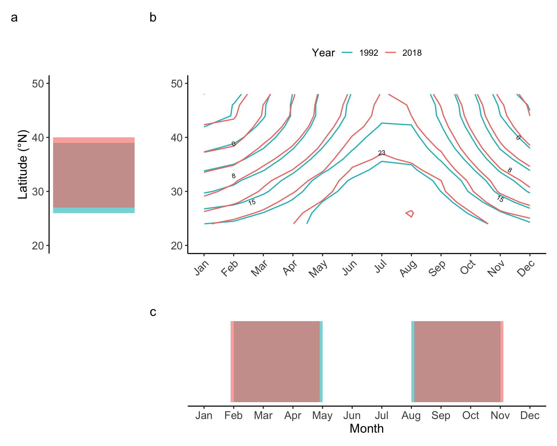
# combine the figures
# Adjust the margins and layout
combined_plot <- fig_lat + p + fig_tem +
plot_layout(design = layout) +
plot_annotation(tag_levels = "a")
# Print the combined plot
print(combined_plot)
When analyzing space-time isotherm plots, we expect species to track climate change by moving perpendicular to the isotherms (i.e., following the shortest path to maintain their preferred temperature). However, it is important to clarify the relative scales of the x- and y-axes:
# figure of isotherm line change with temperature scaled axes

# Parameters
n_lines <- 5           # Number of lines in each group
spacing <- 1           # Vertical spacing between lines
shift_up <- 0.1          # Upward shift for the second group
x_range <- c(0, 5)    # X-axis range

# Create data for group 1
group1 <- lapply(1:n_lines, function(i) {
  data.frame(
    x = x_range,
    y = x_range + (i - 3) * spacing,
    group = paste0("Group 1, Line ", i)
  )
}) %>% bind_rows()

# Create data for group 2 (shifted up)
group2 <- lapply(1:n_lines, function(i) {
  data.frame(
    x = x_range,
    y = x_range + (i - 3) * spacing + shift_up,
    group = paste0("Group 2, Line ", i)
  )
}) %>% bind_rows()

# Combine and add group variable
group1$set <- "1992"
group2$set <- "2018"
all_lines <- bind_rows(group1, group2)

# Plot
ggplot(all_lines, aes(x = x, y = y, group = group, color = set)) +
  geom_line(size = 1) +
  scale_color_manual(values = c("1992" = "#00BFC4", "2018" = "#F8766D")) +
  labs(
    title = " ",
    color = "Year",
    y = "Latitude scaled by\n temperature lapse rate",
    x = "Month scaled by\n temperature lapse rate",
  ) +
  theme(legend.position = "bottom",
            axis.text.y  = element_blank(),
    axis.ticks.y = element_blank(),
    axis.text.x  = element_blank(),
    axis.ticks.x = element_blank()) +
 coord_fixed(ratio = 1, xlim = c(0, 3), ylim = c(0, 3))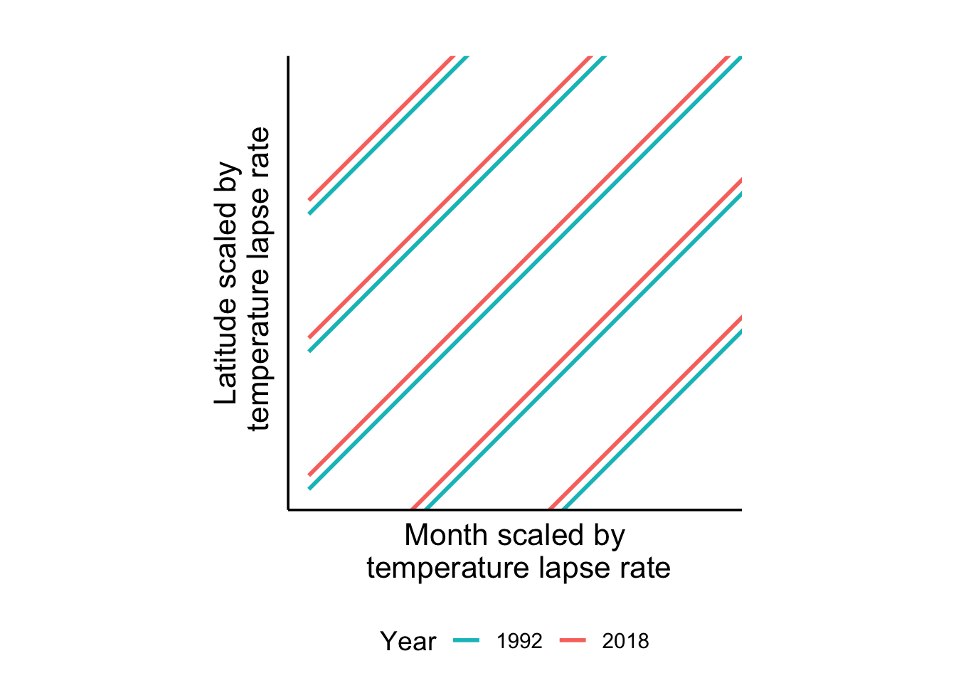
In this scale, we have two expecations:
Perpendicular Movement: species move perpendicularly to the isotherm, which means the species move the same temperature in both direction. In the bird paper, we should expect that, after dividing the temperature change by the lapse rate, the shortest path should be move the same amount in each direction.
Combined Temperature Tracking: The total temperature change captured by a species, considering both spatial and temporal adjustments, should be calculated as the percentage change in one direction multiplied by √2 (rather than simply adding the two percentages).
The bird paper found that birds track temperature changes much more through phenological shifts than through distributional shifts, suggesting it is often easier for species to adjust their timing than their location.
This tracking difficulty difference can be quantified by the ratio of phenological to distributional change; for example, if phenology captures 20% and distribution only 5% of the temperature shift, distributional change is four times more difficult.
In this more complicated scenario considering the tracking difficulties, to assess how much of the temperature shift species track through combined phenological and distributional adjustments, we can check their phenological niche change under 2°C warming:
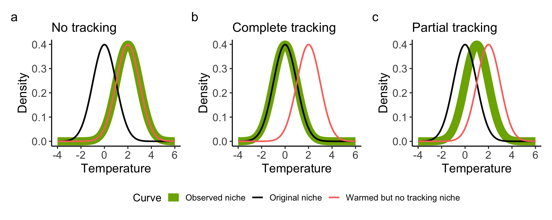
Hypothetical Scenarios (Assuming a 2°C Warming):
No Distribution or Phenology Change (no tracking): Niche shifts +2°C (mirroring environmental change).
Complete Tracking (via Distribution and Phenology): Niche remains unchanged (ideal compensation via distribution/phenology)
Partial Tracking: The observed niche shift would fall between the first two scenarios. The difference between the observed and original niche indicates the lack (insufficient track).
# Adjust the margins and layout
niche_change <-  no_response + perfect_catch + between +
  # plot_layout(design = layout) +
  plot_layout(guides = "collect") +
  plot_annotation(tag_levels = "a") &
  theme(legend.position = "bottom")


# Print the combined plot
print(niche_change)